
For the past decade until now, user interfaces and experiences have been constantly evolving thanks to the continuous innovation of tech in the space of frontend development. Now, as we enter the era of AI (we are probably already in it), UX doesn’t get simpler or fancier — it disappears. Instead of long scrolls, manual searches, and tapping through menus, what we needed was already provided. Maybe it’s Spotify queuing up the next best song, Gmail finishing your sentences, or your shopping app checking out orders with just one tap.
This is the world of Invisible UX, where AI quietly handles interactions behind the scenes to anticipate desired content and remove friction.
What is Invisible UX exactly?

It is an experience where the interface removes itself. Rather than making users go through manual steps using an app, we make the app anticipate it for them. AI mostly powers this by training from behavioral data and predicting needs. So, from an engineering or business perspective, we move from optimizing buttons, menus, and flows to skipping interfaces entirely.
Traditional UX: Search inputs, filter toggles, form inputs
Invisible UX: Recommended products sections, 1-tap checkouts, transactions via biometrics
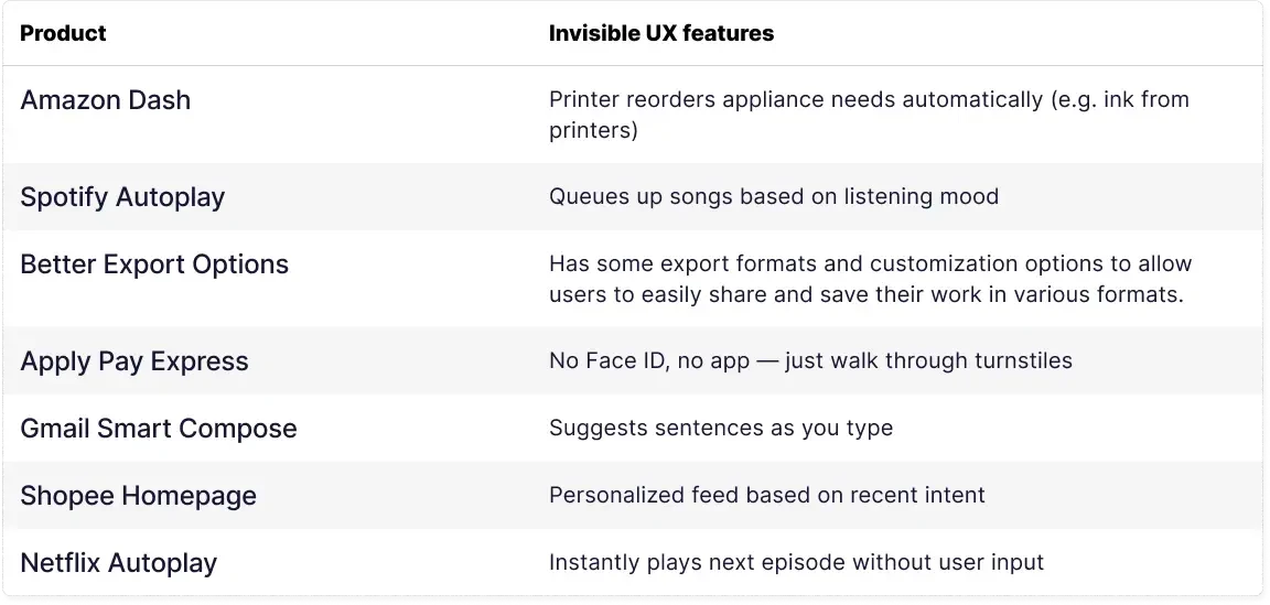
Here are some real world examples where Invisible UX is present:
AI: The Engine Behind Invisible UX
Invisible UX approaches have already existed even before the emergence of AI, but AI has enhanced them to another level that gives UX lesser steps and more relevant content. Here’s how most of these UX approaches are made:
Data Collection: User behaviour, preferences, location, time, and device
Intent Prediction: AI models infer likely next actions
Contextual Execution: Personalized content, reminders, or actions appearing without prompt
This pipeline replaces the traditional frontend flow of "user clicks → app responds" with "AI predicts → user optionally interacts."
The Invisible UX Framework
When UX works best, users don’t notice it at all. Every tap, scroll, and decision feels natural — like the product was built just for them. To intentionally design for this kind of “invisible” experience, we can use this framework. It has three pillars:
Cognitive Flow
- Reduce mental friction.
- Every interaction should answer the user’s unspoken question: “What happens next?”
- Clear signposts (affordances, feedback, hierarchy) guide users without them needing to pause and think.
Emotional Resonance
- UX isn’t just about efficiency; it’s about feeling right.
- Subtle animations, microcopy, and tone can transform a transaction into a moment of connection.
- The goal is not to “wow” but to create calm confidence.
Contextual Adaptation
- Interfaces should flex with context: device, environment, and user state.
- A seamless product anticipates needs — surfacing the right option before you go looking for it.
- Invisible UX doesn’t mean absent design; it means the design adapts so well that it disappears.
How to Apply It
- Audit friction: Identify where users hesitate, backtrack, or seek help.
- Test in context: A flow that feels intuitive on a desktop may collapse on mobile.
The Invisible UX Framework is less about rules and more about sensitivity. It’s the practice of noticing what users don’t notice — and deliberately crafting for those invisible moments.
When Invisible UX Misfires
Invisible UX can backfire if AI makes an error. The following are real examples of products where Invisible UX approaches can cause unintended results:
- Spotify (2024): Smart Shuffle repeatedly played the same songs for months, causing user frustration — personalization had turned into stagnation.
- Amazon (2023): Some users received auto-reorders for one-off products (such as Halloween costumes) — AI misunderstood their intent.
- Netflix (2024): Autoplay of unwanted shows made users feel trapped — no off switch, no consent.
- Shopee (2024): Over-targeted homepage showed irrelevant or personal products (like pregnancy kits after gifting), triggering discomfort.
These moments show how invisible UX isn’t always frictionless. Sometimes, the missing interface is the problem. However, we should already be aware that automating things can always come at the price of lacking optimized control.

What Designers and Developers Can Do
Invisible UX requires a shift in how we build digital experiences.
- Design for intent, not just interaction
- Use AI-powered personalization thoughtfully (e.g., reorder suggestions, prefilled fields)
- Invest in edge infrastructure for real-time UX
- Allow users to opt out or override invisible actions
- Treat trust as a UX metric — transparency matters
Invisible UX is about less UI, more intelligence.
What does this mean going forward
Invisible UX is the new frontier — one where AI does the heavy lifting behind the scenes. It’s fast, personal, and elegant when done right. But it’s also a minefield of overreach, ethical concerns, and technical complexity.
As designers and developers, our job isn’t just to build pretty interfaces anymore. It’s to know when not to build them — and how to create systems that quietly, intuitively, help users succeed.
Because in the end, the best interface is no interface at all.
About the Contributor
 John Patrick AlagarView ProfileAssociate Software Engineer
Discuss this topic with an expert.
Related Topics
Evolving Storefront Architecture with Backend-For-Frontend (BFF)As our clients expanded into new markets and channels, maintaining separate integrations for each API became costly and time-consuming. Our platform’s adoption of GraphQL changed that — creating a single data layer that unifies product, pricing, and content APIs into one flexible interface.

Level Up Shopping: How Gamification Is Transforming E-CommerceHow AI and Playful Design Are Redefining Customer Loyalty
Software Development in the Age of AIAs AI-assisted development becomes the norm, the need for standardized context management systems arises for team workflows.