
Enhancing Accessibility: Solving 7 Common Keyboard Navigation Challenges

Introduction
If you haven’t read part 1, go read it here
In this blog, we will explore how to improve accessibility by solving seven common keyboard navigation challenges. This blog post can be valuable for developers working on their applications.
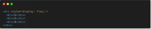
1. Skip to content
Skip to content is a common accessibility feature used to help users who rely on screen readers or keyboard navigation to quickly bypass navigation menus and go directly to the main content of the web page. This improves the user experience.
To implement the "Skip to content" feature, you can add a hidden link at the beginning of your web page that becomes visible when focused, allowing users to activate it using the keyboard.
Here’s a simple snippet on how to implement it:

Note that you can implement your own styling (I just did a barebone design).

When the user tabs to it, the skip to content will become active, and the user has the option to directly go to the main content of the web page.
2. Megamenu and navigation keyboard alternative for hover behaviors
First let’s discuss what are the challenges of hover based megamenus:
Hover based megamenus can be challenging for users who rely on keyboards. Keyboard users might struggle to access hidden content due to the lack of focusable elements, leading to unpredictable navigation. Additionally, touch screen users cannot access hover interactions. Implementing keyboard alternatives for hover behavior is crucial for creating a user-friendly experience.
How to support mega menu keyboard navigation:
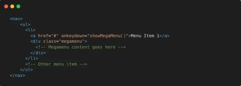

Instead of relying solely on hover events, we can use focus events to trigger megamenu. When a user navigates to a menu item using keyboard, the megamenu should open automatically, revealing the hidden content.
We should also support closing on the escape key or outside click of the menu area.
3. Focus Trapping for Overlays

Challenges without focus trapping:
Without focus trapping, keyboard users may face challenges using overlays or modals. They might accidentally move away from the overlay and have trouble getting back (unintended tabbing). Consistent focus behavior is essential for a user-friendly experience, especially for screen reader users who rely on keyboard navigation.
We can also use the dialog element since it is accessible and can be easily navigated by using keyboard and screen reader users.
For those who use custom overlay we can use react-focus-lock
React-focus-lock is a simple and effective react library that provides an easy to use solution for focus trapping.
Make sure you already have react installed in your project you can follow the instruction for installing react-focus-lock
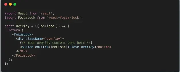
In this component, we import the necessary packages and create an overlay component that we can use in our application. The “FocusLock” component is the one that trap the focus.
We can also use Radix UI and Shadcn UI since it offers accessibility out of the box.
4. Custom clickable and hover elements

We can opt to use buttons and anchor elements instead of adding onlick to div tags. Button and links are designed for this purpose, making your site more user-friendly. They’re easier to manage and improve accessibility. So remember for a user friendly web experience, opt for buttons and anchor elements.
For example, customizing checkboxes and radio buttons can introduce navigation challenges, but with the right approach, we can ensure accessibility.
We can follow these simple steps:
- Use semantic HTML Elements - we can stick to <input type=”checkbox”> and <input type=”radio”> elements for proper keyboard support.
- Focus styles - add clear focus styles to help users understand which option is selected.
- Add event listeners - incorporate keyboard event listeners for “Enter” and “Space” to mimic the default behavior.
Handling Hover Effects
Hover effects can be challenging for keyboard and mobile users since they don’t have a cursor. To make your applications more accessible, use focus based interactions (like :focus) or Javascript event listeners instead of relying only on hover. Also, consider ARIA tooltips for elements with hover effects, triggered by keyboard focus and read by screen readers, making the content accessible to all users.
5. Keyboard tab is not semantic order and use of CSS to order elements
First, let’s talk about the importance of semantic tab order. When users navigate to your website using a keyboard, the tab key allows them to move from one interactive element to another, such as links, buttons, form fields, and other focusable elements. If the tab order is not logical, users might struggle to find the elements they need, which will lead to frustration and a poor user experience.
Let’s imagine a scenario where a user needs to fill out a form, such as sign up, but the tab order jumps randomly from one field to another instead of following the natural sequence of the form.
How to solve this common problem:
1. Utilizing Semantic HTML
The foundation of a meaningful tab order starts with using semantic HTML.
Example:
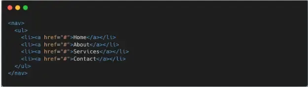
By using appropriate HTML elements and their order, we can create a logical tab order sequence. For instance, structuring a navigation bar with `nav` and `ul` elements to establish a well defined hierarchy.
2. Do not use unnecessary css tab order
You might run into this problem using a third party package, and it might result in using CSS tab order.
Example:

Note that this is just an example, do not use it on a real world project.
In this code, we are currently using the tab order property, which modifies the visual order of the elements, but guess what? This property changes the tab order as well, which will result in a poor user experience.
How to solve it?
We can solve this by removing the order property and letting the normal sequence work.
As a best practice, while CSS provides the ability to order elements, it should never be used if you have access to the DOM. While there are valid use cases, it should be the last resort.
6. Autocomplete Keyboard navigation
Autocomplete is a common feature that helps users find options as they type. But for people relying on keyboard navigation may struggle to use it effectively. To ensure a more inclusive and user friendly experience, developers can make autocomplete accessible for all users.
For Example:

Credit to Algolia Live Demo
Algolia’s autocomplete functionality - to understand how autocomplete keyboard navigation accessibility can be integrated When a user begins typing in the search bar, Algolia’s autocomplete presents a dynamic list of data suggestions. To cater keyboard users, pressing the “Arrow” or “Tab” keys allows them to navigate through suggestions. Each suggestion becomes highlighted as the focus shifts, and users can use the “Enter” key to select their desired option. Additionally, the “Escape” key can be used to close the autocomplete dropdown.
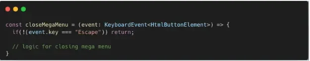
7. Supporting the Escape (ESC) button to close popups, modals and clearing text

Supporting the ESC button simplifies closing popups and modals while also clearing text, making keyboard navigation easier for all users. This small addition improves accessibility.
Here’s a simple snippet on how to support the escape button to close popups, modals, and clearing text.
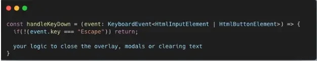
We can attach this function to onkeydown and implement your logic based on your needs.
Conclusion
In conclusion, making websites and applications work better with keyboards is super important. The seven things mentioned above, especially for those who might have trouble using a mouse, can be used easily. These include making it easy to jump to the main content, finding ways to move around the megamenus without a mouse, and making sure things like modals, pop-ups, and trays can be closed easily. And arranging things in a sensible order when you navigate using the tab keys. By solving these common challenges, we can ensure a user-friendly experience for everyone.
About the Contributor
 Ericson RemocalView ProfileAssociate Software Engineer
Discuss this topic with an expert.
Related Topics

What is Answer Engine Optimization (AEO) and Why It Matters in the Age of AIThis article explores Answer Engine Optimization (AEO), a strategy for creating content that delivers direct, zero-click answers through AI-powered tools. It highlights key differences from SEO and offers practical steps for businesses to stay visible in the age of AI.

Boosting Website Performance with Lazy LoadingLazy loading is a web optimization technique that delays the loading of non-critical resources until they are needed. In this article, we take a deeper look at the benefits of lazy loading and how to implement this for your website.

Slow Websites Are Killing Your AI Conversions: The Hidden Costs of Poor PerformanceWhile companies race to adopt AI, they often overlook a fundamental and timeless factor: website performance.