
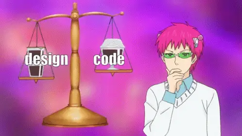
Breaking Free from Pixel Perfection: Bridging the Gap Between UI Design and Development
"Art is the lie that enables us to realize the truth." - Pablo Picasso
I used to follow Figma designs religiously and made it a habit to follow the design up until the last pixel, as it is expected that our work should be as close as possible to the given designs. But this eventually came to a halt when some issues and unknowns started to appear during or after development while maintaining a picture-perfect implementation.
Usually, these issues are related to responsiveness or functional behaviors that are not considered in illustrations. These are fairly common problems faced in UI engineering as design implementation can overlook architecture from a developer’s perspective.
This is why it’s important for developers, especially from the front-end side to notice these nuances between design and code and question them so that the right actions can be made to satisfy both parties and users for a seamless UI experience.
I want to share a few specific reasons on why I think you should consider embracing your creative freedom and be practical as a developer outside of the given design requirement.
1. Limited Responsive Design
“Responsive design is the art of creating a single design that works well on a variety of screen size and devices.” -Ethan Marcotte
I have worked on a project where we have been given Figma designs of a website for both mobile and desktop views. Desktop designs use 1440px viewport widths while mobile has 375px, which were pretty standardized screen sizes.
So what about tablets? Well, we had a general rule regarding tablet viewports (portrait) which should follow the same design as mobile. It works for the most part, but sometimes there can be problems with implementations for tablet view since some designs can be interpreted in multiple ways.
To put more context, here’s a similar scenario I encountered:
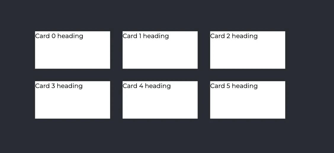
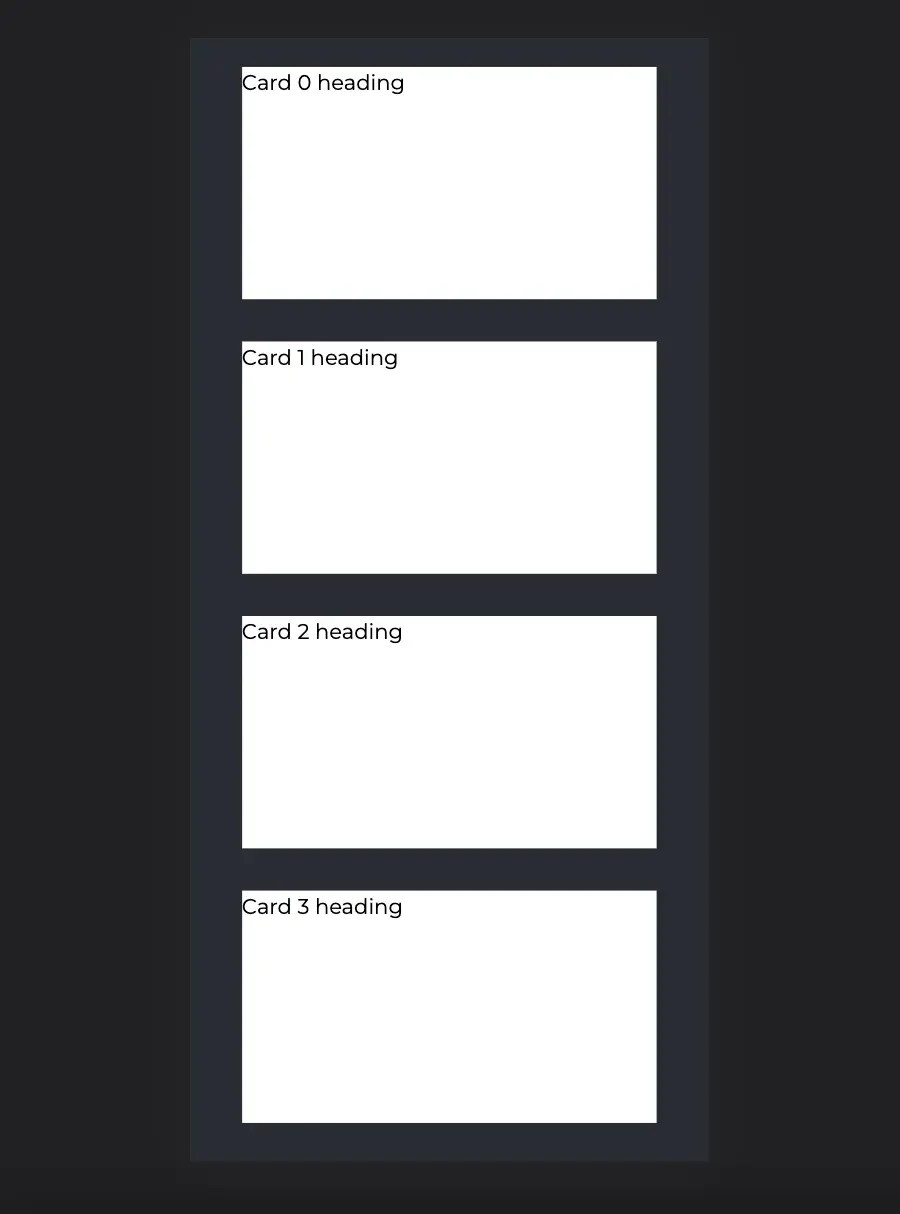
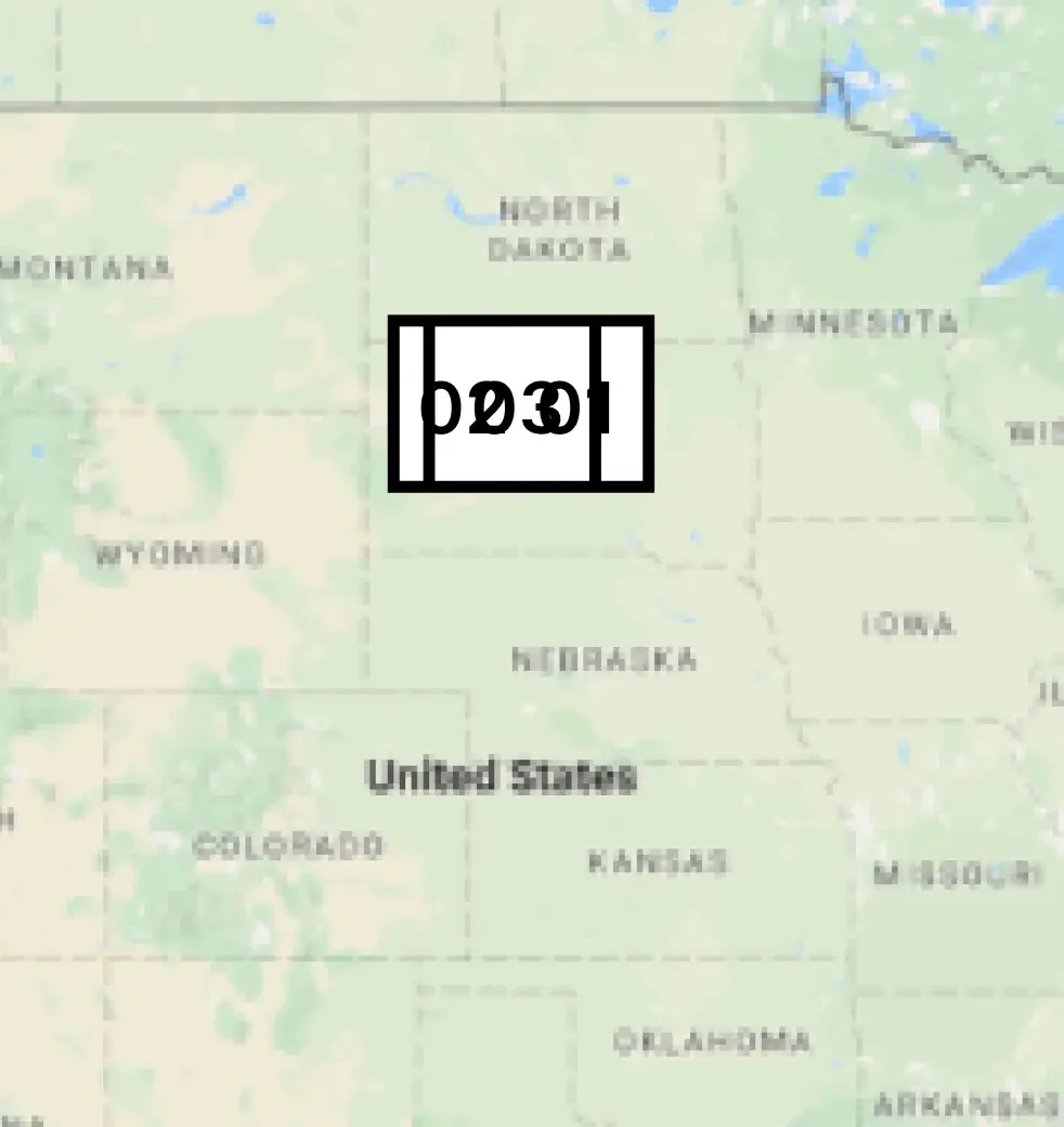
I needed to implement a cards list component where on mobile it is displayed as a single column, and displayed in three columns for desktop view.
Desktop view:
Mobile view:
So I assessed the design from desktop to mobile, and came up with the following questions:
- Should it stay in a single column across tablet viewports? This would result in each card component having a different size for each viewport.

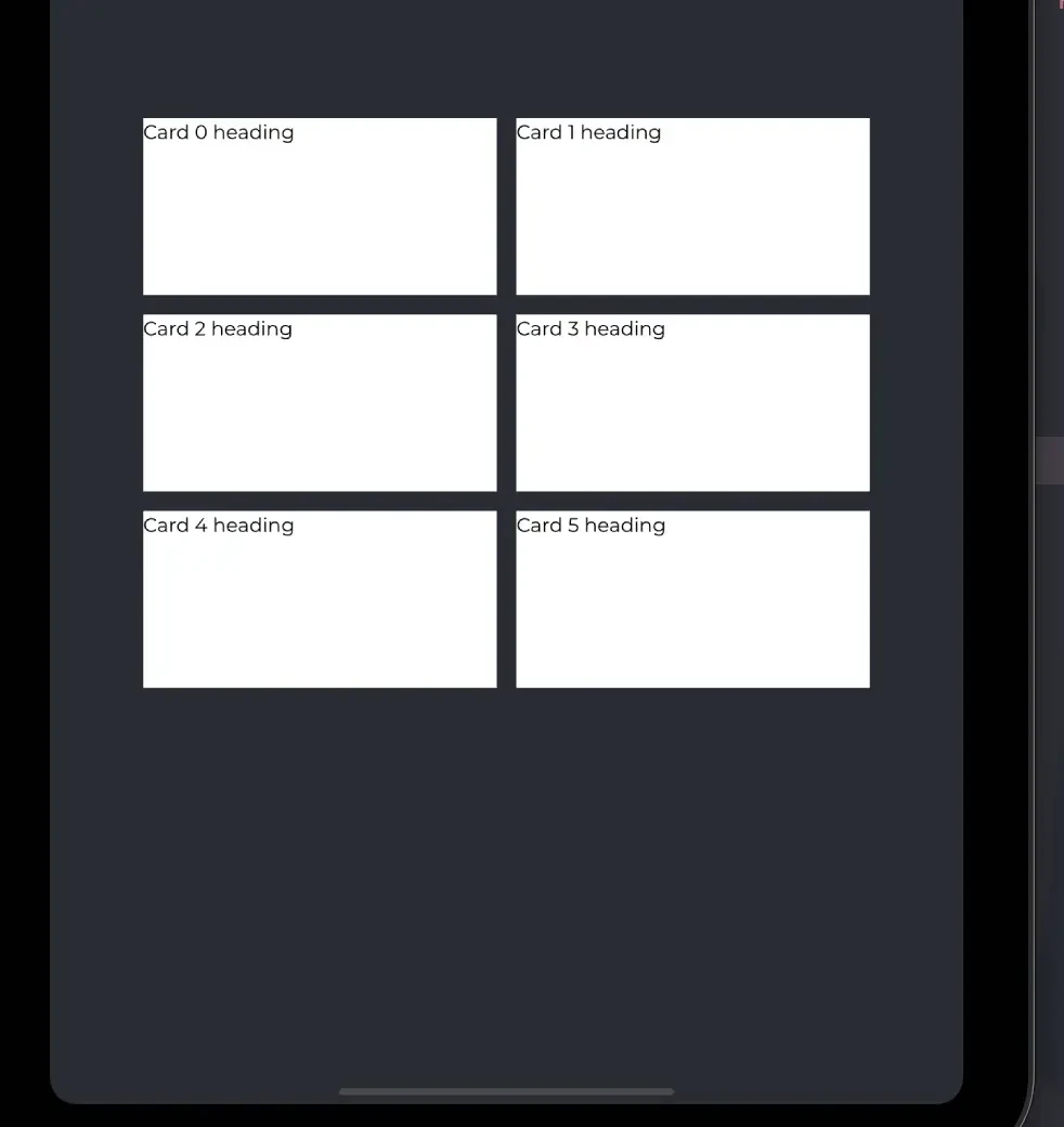
- Should it follow the grid format and split into a new column if it fits the current viewport? For example, if it approaches tablet view, you would get 2 columns of cards.
- Should the cards have a consistent size/dimension for every viewport?
- How should the orientation of the cards look like if they aren’t evenly distributed per column? (e.g. In desktop view, if you have 4 cards or 7 cards, should the empty spaces per row be left as is or should the cards be horizontally aligned at the center?
By asking these, we eventually came to a conclusion with business and decided to keep the grid format through every viewport.
“The role of the artist is to ask questions, not answer them.” -Anton Chekhov
Implementing any scenario from those questions can work just fine, but they can help devs, designers, and business analysts decide on a strategy for what makes a seamless UI experience.
2. Functional Limitations
"Design is not just what it looks like and feels like. Design is how it works." - Steve Jobs
When implemented, some design features may pose complications where certain functionalities break the design, or it can be the other way around where the design may limit the functionality. This is one of the most common scenarios that may occur in UI development, simply because design illustrations may lack or possibly overlook the simulation of features and how they would behave.
Here’s another similar scenario I encountered for this matter:
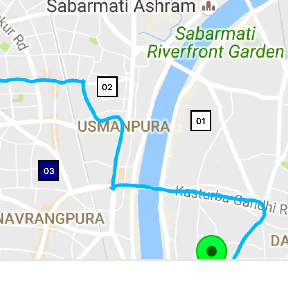
I was working on a feature for a store search page with a map view and a list view, where if you search for a certain location, it would return the exact location points of each store in the map and the list within the vicinity of the location entered. Each map point and list item is clickable, and if selected, it would zoom in on the store location and highlight the corresponding store from the list and vice versa.
It was a pretty straightforward implementation, but upon testing it, there was a catch.
When the map view is zoomed out, the points naturally tend to go closer to each other since the distance gets smaller on a larger map view. The problem is when two location points become too close where they collide, it becomes a pile of map points with messy, jumbled text. This results to some points not being clickable if they are colliding with each other.
I wasn’t provided any details as to what should be done about this behavior, so I brought this issue up for discussion. Unlike the previous scenario, this one is a bit more complicated for the following reasons:
- There were a lot of possible ways I could think of that would solve the issue, most of which included adding extra features and UI components. This would mean extra design features and elements, which would be costly.
- There wasn’t an easy and straightforward solution for making all the colliding points clickable on the map since it is basically a limitation of the design.
After opening this for discussion, we came to a conclusion with a slight workaround.
It was decided that if the map points were colliding, they would be shown on top of each other by order based on the list of store locations. This means each map point would have a different `z-index` value, from highest to lowest in list order.
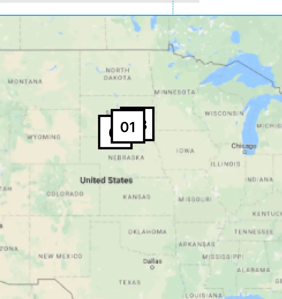
(since `01` indicates being the first store location from the list order, it is in front of the other points upon collision)
This would also mean that the non-clickable points within colliding points would only be accessible if the user zooms in the map, which results in the points going farther apart in the map canvas.
So technically, this concluded solution was more of accepting the functional limitation of the design while improving the user experience.
3. Flexibility of Content
"Design in the absence of content is not design, it's decoration." -Jeffrey Zeldman
Even with a good and accurate implementation of a well-made design architecture, your application’s pages can provide a different experience depending on your content or data. Assets can potentially influence how a design structure would look and feel.
Developers usually take the lead on handling these types of issues, since they mostly involve the scalability and flexibility of UI components.
As always, here’s another scenario from my experience:
I was working on a zoomed gallery feature for a product’s images. It has a minified images bar that serves as a navigation component where if you click a minified image from the navigation, it will automatically scroll you in place to the designated zoomed image. Naturally, I set the scrolling pivot to the center of each selected image.
The issue was that most of the images that were being used by our product pages had a lot of white space from the top to the center of the image since the product was positioned at the bottom.
Therefore, it would automatically scroll you to the center of the image where you could barely see the product:
To fix it, we simply resolved it by setting the scrolling pivot near the bottom of each image.
Now that is just a simple and very specific issue, but here are examples of issues that are much more common which you probably come across quite often:
- Dealing with long text/content that would exceed the initial height/width of the parent component.
- A common strategy would be scaling the parent component to fit more text/content and wrapping it.
- How images/videos would be displayed with consideration to different media sizes/dimensions.
- This usually concerns the `object-fit` property in CSS, if an image should `fill` or ` cover` a parent container, or if you want it to `contain` the image.
- Making sure font/content color would be flexible or consistently blend in with various background colors.
Most of the time, a design illustration can never tell the whole story. The key point is that we have to broaden our perspective on how certain features in a given design would scale and adjust with different types of content.
This also means having to consider even the most unrealistic content situations, such as absurdly long or large content for example.

"In this world, there are no sides, only angles. If you look at it from the right angle, everything fits." - Hachiman Hikigaya (My Teen Romantic Comedy SNAFU)
Practicality is Key
Now with all those reasons I mentioned, am I saying that you should not bother fully imitating a given design during development?
No. Instead, I suggest keeping an open mind on what can or cannot work in the creative space to find the middle ground. We want to develop our application as close as possible to what our designers envisioned, but we also shouldn’t follow it blindly.

"If you only face forward, there is something you will miss seeing." - Vash the Stampede (Trigun)
Coming Together
Having a healthy balance of aesthetics and practicality is a recipe for good UI design and development.
Designs and illustrations aren’t perfectly made to guide the full implementation for developers. Never was, and probably never will be, which is normal. There will always be a fine line between creative design and practical development, and it is our job as both engineers and designers to find harmony between design illustrations and code.
"The intersection of design and development is where the magic happens." - Lea Alcantara
About the Contributor
 John Patrick AlagarView ProfileAssociate Software Engineer
Discuss this topic with an expert.
Related Topics
Evolving Storefront Architecture with Backend-For-Frontend (BFF)As our clients expanded into new markets and channels, maintaining separate integrations for each API became costly and time-consuming. Our platform’s adoption of GraphQL changed that — creating a single data layer that unifies product, pricing, and content APIs into one flexible interface.

Level Up Shopping: How Gamification Is Transforming E-CommerceHow AI and Playful Design Are Redefining Customer Loyalty

Invisible UX: When the best interface is no interfaceTurns out less really is more.